Use Dashboards
The dashboard is NeoMind's core visualization surface. Drag widgets onto a canvas, bind them to device data sources, and watch telemetry, AI inference results, and device state update in real time.
Overview
Each dashboard is a responsive grid that can hold multiple widgets:
- Real-time updates: Data changes are pushed via WebSocket / SSE — widgets update within seconds
- Responsive layout: Drag-and-drop editing on desktop; auto-stacked single column on mobile
- Shareable: Generate public links with expiry times — no login required to view
- Multi-instance: Register and switch between multiple NeoMind backend instances from the sidebar
Creating a Dashboard
- Click the Visual Dashboard icon in the left navigation to open the dashboard list
- Click the + (New Dashboard) button
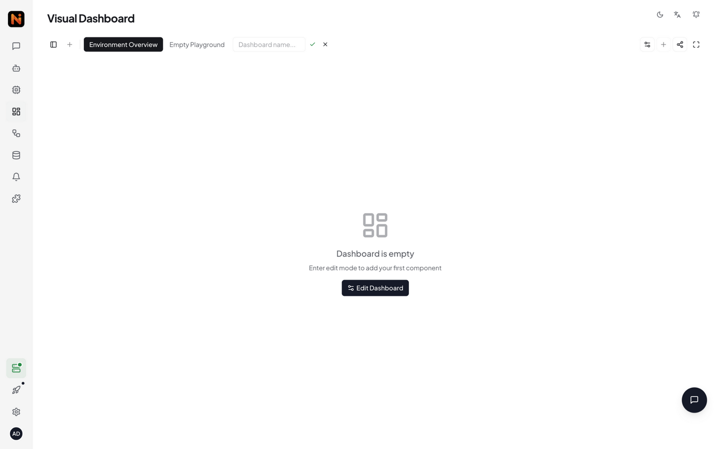
- Enter a name (required) and description (optional), then click create
- The new dashboard enters edit mode automatically with an empty canvas
The dashboard list shows all created dashboards — click any name to view it:
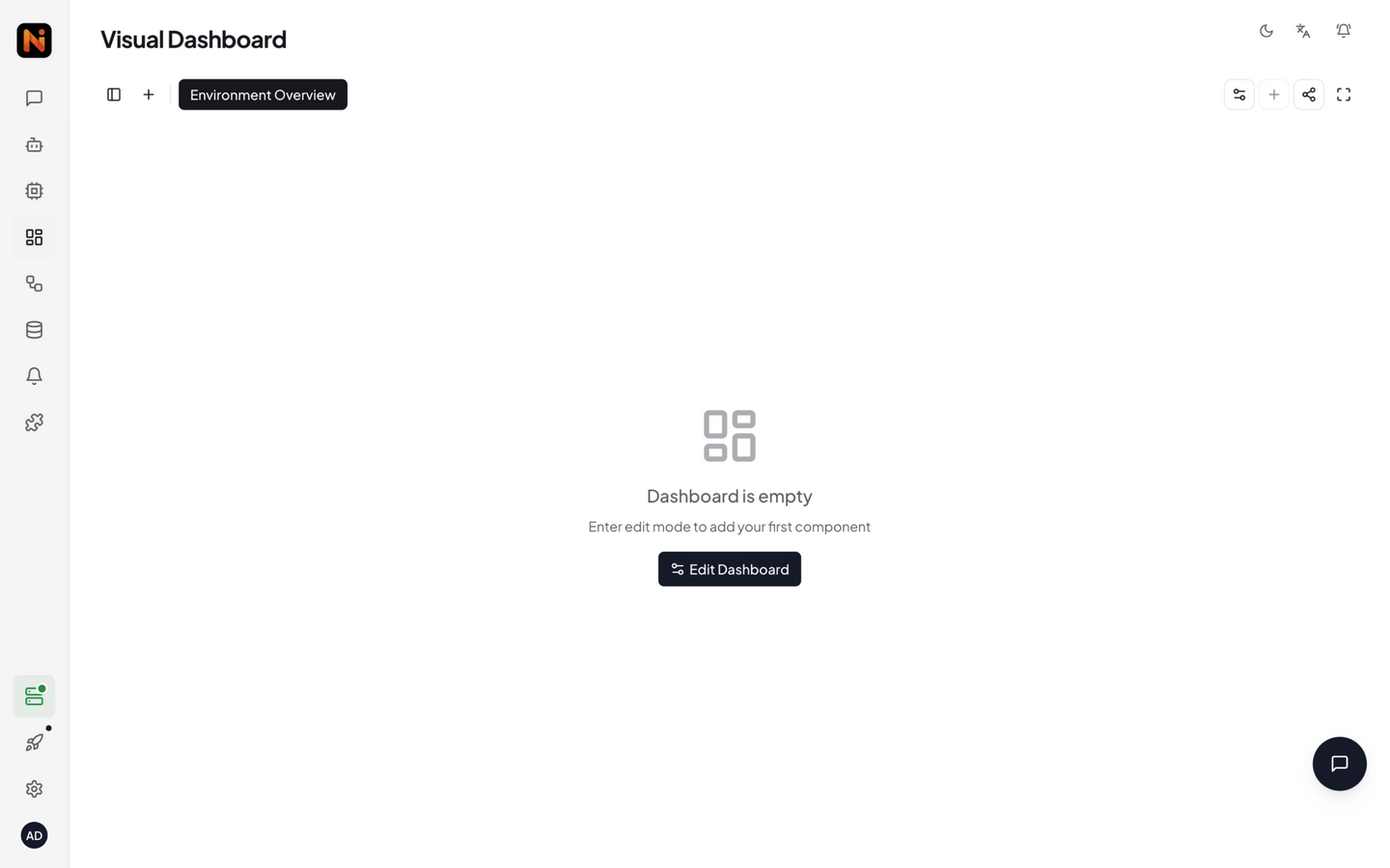
View Mode vs Edit Mode
Dashboards have two modes, toggled via the gear / checkmark icon on the left side of the toolbar:
| Mode | Description | Icon |
|---|---|---|
| View Mode (default) | Layout locked, shows real-time data only. This is what regular users and share link visitors see | Gear icon (Settings2) |
| Edit Mode | Drag widgets to reposition/resize, add/delete widgets, edit configurations. Grid supports snap-to-align | Checkmark icon (Check) |
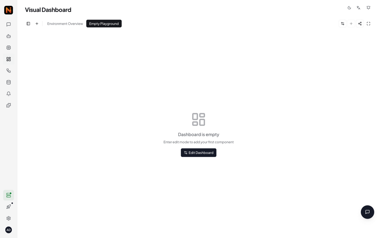
An empty dashboard in view mode shows "Enter edit mode to add your first component". Click the gear icon to enter edit mode, which reveals the Add Component button.
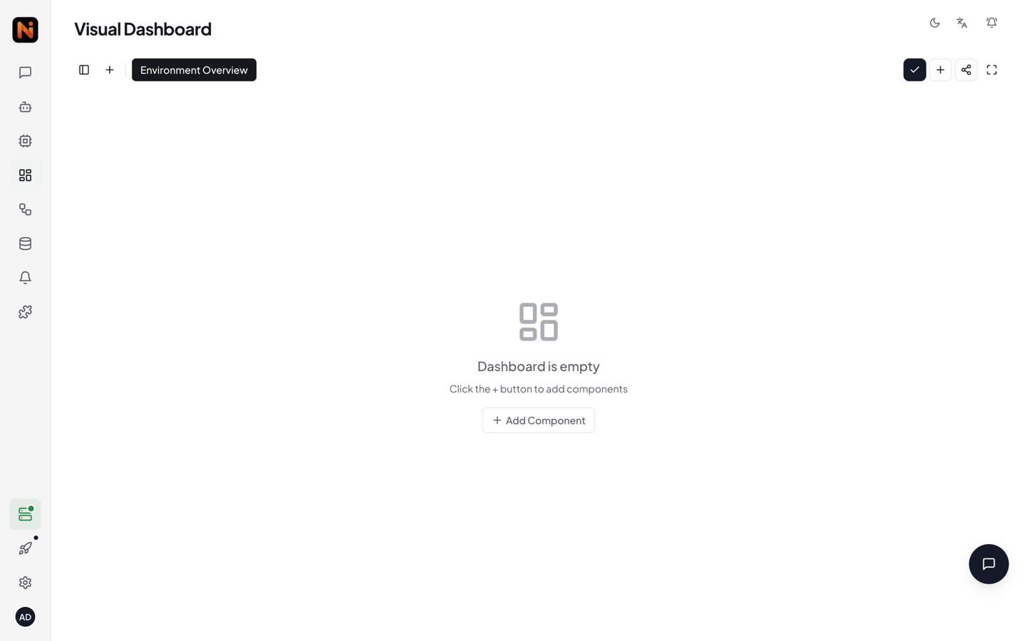
Adding Widgets
Component Library
In edit mode, click Add Component to open the component library panel. The panel has four tabs:
| Tab | Contents |
|---|---|
| Components | Platform built-in widgets, grouped by category (see below) |
| Extensions | Dashboard widgets bundled by installed extensions (e.g. video stream player, detection view) — full catalog in Extension Management |
| Marketplace | Install online from the community widget repository |
| Custom | Import your own ZIP widget packages or server-path widgets |
Built-in widgets are grouped by category:
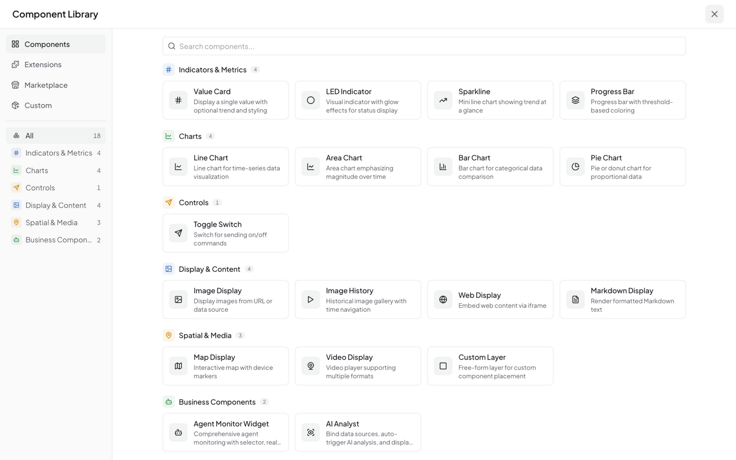
Indicators & Metrics
| Widget | Purpose | Typical Use |
|---|---|---|
| Value Card | Large-font single value display with unit and threshold coloring | Temperature, humidity, counters |
| LED Indicator | On/off status indicator light | Device online status, valve open/closed |
| Sparkline | Mini trend line for compact layouts | Quick trend preview |
| Progress Bar | Horizontal/vertical progress bar | CPU usage, storage utilization |
Charts
| Widget | Purpose | Typical Use |
|---|---|---|
| Line Chart | Time-series line trend | Temperature history, flow trends |
| Area Chart | Filled time-series chart | Cumulative volume, inventory levels |
| Bar Chart | Discrete data comparison | Production output by line, weekly stats |
| Pie Chart | Proportion distribution | Device type breakdown, alert categories |
Controls
| Widget | Purpose | Typical Use |
|---|---|---|
| Command Button | Opens a command form dialog to send commands to devices or extensions | Remote switching, parameter delivery |
Business Components
| Widget | Purpose | Typical Use |
|---|---|---|
| Agent Monitor Widget | Agent selector, real-time status, statistics, and execution history | Monitoring inspection agents |
| AI Analyst | Timeline-style AI analysis of images, metrics, and data sources | Data interpretation, anomaly attribution |
Display & Content
| Widget | Purpose | Typical Use |
|---|---|---|
| Image Display | Show latest image frame + AI annotation boxes | YOLO detection results, camera snapshots |
| Image History | Browse historical images by time | Security playback, event tracing |
| Web Display | Embed external webpage via iframe | Third-party panels, documentation |
| Markdown Display | Rich text notes | Dashboard title, instructions |
Spatial & Media
| Widget | Purpose | Typical Use |
|---|---|---|
| Map Display | GPS coordinates + trajectory | Vehicle tracking, asset distribution |
| Video Display | RTSP / RTMP / HLS live video stream | NE301/NE101 live camera feed |
| Custom Layer | Community or custom-built widgets | Any extension |
Beyond built-in widgets, you can install more from the Marketplace tab in the component library, sourced from the community marketplace.
Configuring Widgets
After selecting a widget type from the library, it's added to the canvas and a configuration panel opens. Key configuration areas:
① Data Source Binding
Each widget needs a data source to display data. Data comes from the currently connected NeoMind instance; in the config panel, select:
| Selection | Description |
|---|---|
| Device | Choose which device's data to display |
| Metric | Choose the specific metric (e.g. temperature, humidity) |
After selection, a DataSourceId is auto-generated in the format {type}:{id}:{field}:
| Type | Example | Meaning |
|---|---|---|
device | device:esp32-01:temperature | A device metric |
extension | extension:weather-forecast:temperature | An extension metric |
transform | transform:tf-01:avg_temp | A transform-derived metric |
DataSourceId is auto-generated — no need to write it manually.
② Display Options
Depending on widget type, you can configure:
- Title / Unit: Name and unit shown above the widget
- Color / Threshold: Change color when value exceeds threshold (e.g. temp > 30°C turns red)
- Time Range: For chart widgets — presets (last 5 minutes to 24 hours, today / yesterday / this week) or custom
- Refresh Interval: Data pull frequency (doesn't affect real-time push)
③ Layout Adjustment
- Drag: Hold and drag a widget to reposition — grid auto-aligns
- Resize: Drag the bottom-right corner to resize
- Delete: Select a widget, then press Delete key or click delete in the config panel
Real-time Data Flow
NeoMind pushes device data to the frontend via WebSocket / SSE:
- Device publishes MQTT data → backend event bus → subscribed widgets refresh
- End-to-end latency typically < 1 second (same datacenter)
- On disconnect, the frontend auto-reconnects and backfills recent data
For historical data queries, use the widget's "Time Range" setting (last 1 hour / 24 hours / custom, plus other presets).
Data Explorer
The Data Explorer page is a centralized place to browse all data sources on the platform — device metrics, extension metrics, and transform-derived metrics in one place. It is also the management entry for data push (the Push tab).
Click any data source to open a fullscreen detail view:
- Left pane (current state) — value card and metadata; numeric metrics also show a min / max / avg statistics grid
- Right pane (history) — trend chart (numeric metrics only) + paginated history table
The history table uses server-side pagination — even very old data can be paged through, no longer limited by the frontend cache size. The trend chart shows the latest 500 points by default, with a hint when truncated. String / boolean / image metrics have no trend chart — table only.
Sharing Dashboards
You can generate public links to share dashboards with unauthenticated users:
- Click the Share icon in the dashboard toolbar
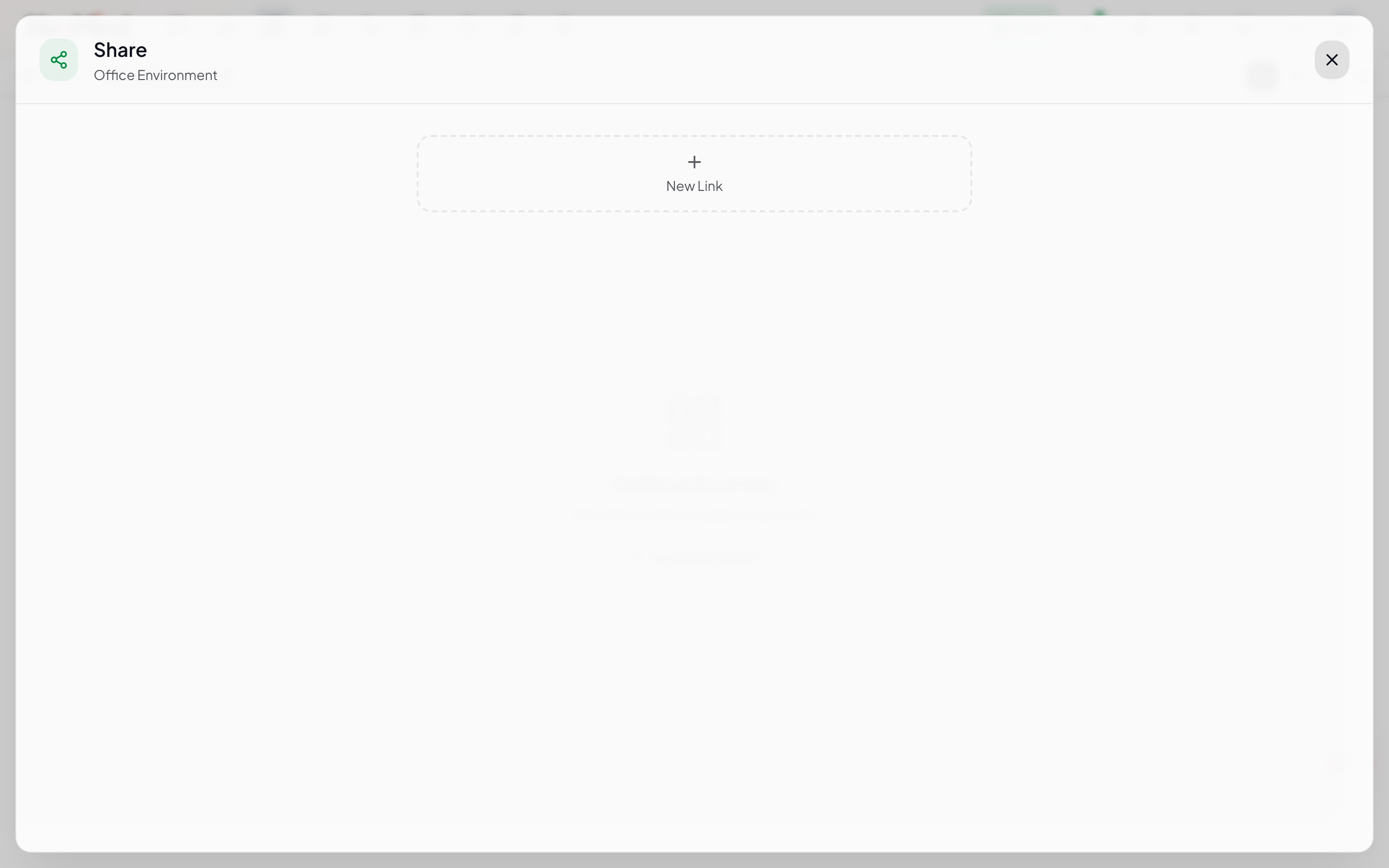
- Click New Link to generate a new link
- Set the expiry time (1 hour / 24 hours / 3 days / 7 days / 30 days / never)
- Copy the generated link (e.g.
https://your-host/share/<token>) - Recipients can view without an account (read-only)
The share dialog supports an interactive mode — visitors may also press device-control buttons you expose (e.g. issue commands), but still cannot edit the dashboard layout.
Share links never expose API keys or other dashboards. Except for device-control buttons explicitly enabled via interactive mode, visitors only see a read-only view of that specific dashboard. Links automatically expire after the set duration.
Mobile Experience
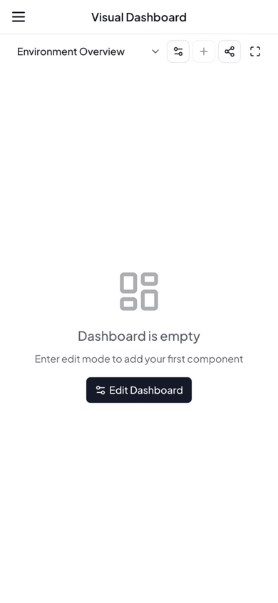
- Responsive breakpoint: < 768px switches to single-column stacked layout
- Edit mode: Drag-and-drop editing is disabled on mobile (screen too small) — edit on desktop
- Touch interaction: Charts support pinch-to-zoom and swipe-to-pan
- Mobile web: Access
http://your-host:9375directly in browser — no app install needed
Multi-Instance Dashboards
If you manage multiple NeoMind backends (e.g. multiple edge servers in a factory), you can register them via Instance Management (Instances), opened from the instance switcher in the left sidebar. Once registered, you can switch to an instance with one click — a dashboard shows the device data of the currently active instance.
Community & Custom Widgets
Built-in widgets cover common IoT visualization needs. For more widgets, NeoMind offers two ways to extend:
Option 1: Install from Marketplace
Switch to the Marketplace tab in the component library to browse the community widget marketplace:
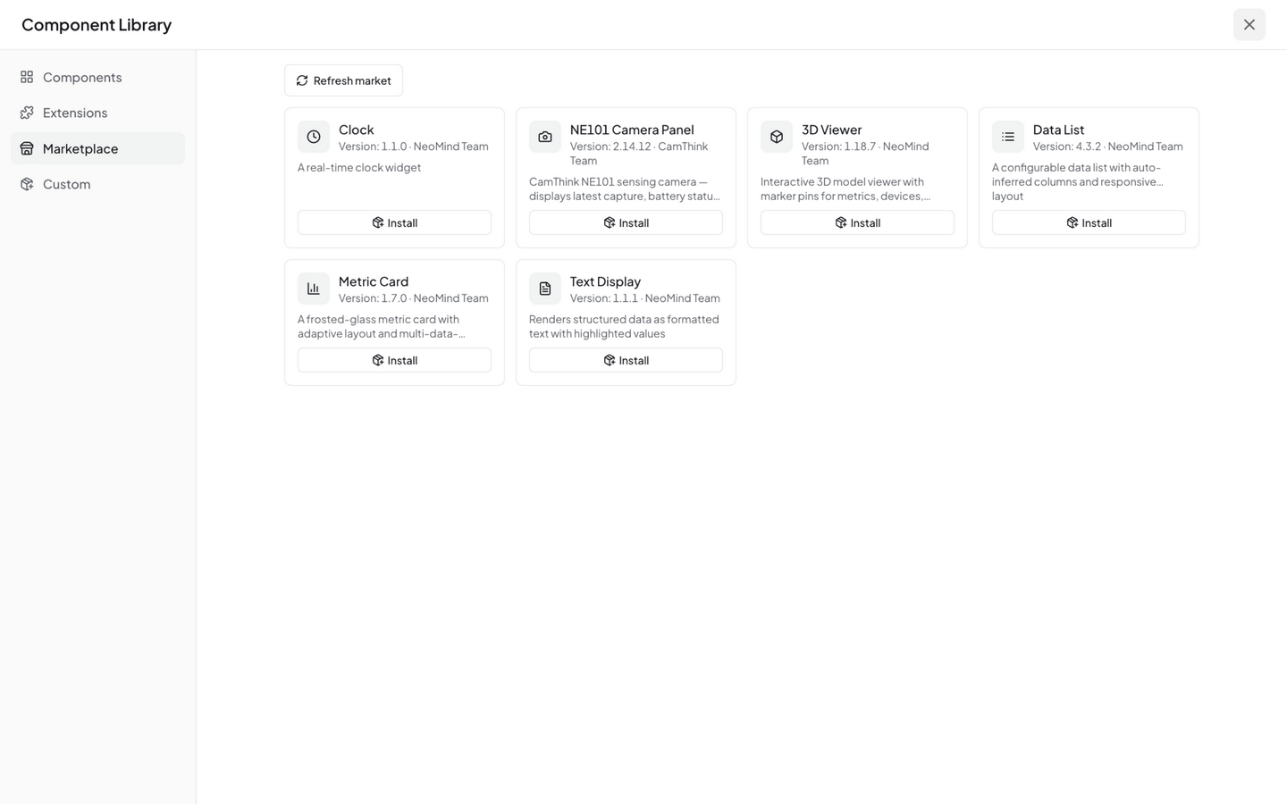
Each widget card shows:
| Info | Description |
|---|---|
| Widget name + icon | Widget identifier |
| Version | e.g. v1.1.0 |
| Author | e.g. NeoMind Team, CamThink Team |
| Description | Brief summary of widget functionality |
| Install / Uninstall | One-click install or remove |
Click Install to add a widget. Once installed, it appears under the Marketplace category and can be added just like built-in widgets. Installed widgets show an Uninstall button for easy removal.
Marketplace widgets come from the NeoMind-Dashboard-Components community repository, continuously updated.
Option 2: Import via ZIP Upload
If you've developed your own widget or obtained a widget package from another source, you can upload it via Import Component:
- Switch to the Custom tab and click the Import Component button
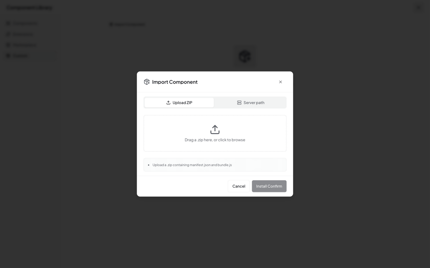
- Click the upload zone to select a
.zipfile (or drag a file onto the zone); on desktop/server deployments you can alternatively use server-path import (expand the advanced options and enter the widget package's path on the server directly) - The ZIP must contain
manifest.json(widget metadata) andbundle.js(widget code) - Click Install Confirm to complete the installation. Imported custom widgets are all managed under the Custom tab (widgets installed from the marketplace remain under Marketplace)
See Developer Guide — Dashboard Component Development for the ZIP package structure.
You can also install via CLI:
# List available marketplace widgets
neomind widget market-list

# Install a marketplace widget
neomind widget market-install <widget-id>

# Install from a local ZIP file
neomind widget install /path/to/widget.zip
Building Custom Widgets
Want to build your own? A NeoMind widget is essentially a ZIP package (manifest.json + bundle.js) written in React and bundled as an IIFE. Once built, upload it via Import Component to start using.
See Developer Guide — Dashboard Component Development for the full development workflow.
Next Steps
- AI Chat — Query device data in natural language
- AI Agent — Scheduled / event-triggered autonomous monitoring
- Automation Rules — Automatic alerts when data crosses thresholds
Last updated: 2026-09-08